Showing posts with label Year 2. Show all posts

Wednesday, 5 April 2017

Self Publishing 6 , Mural work

Mural Work

At the beginning of this lecture we were split into groups and asked to pick words out a hat that created the sentence L'imagination prend le pouvoir (Imagination is power). My specific group was given L'imagination. We each created a design that was then voted to be part of the final piece. Sadly my design wasn't picked :'( The designs we created were drawn on a grid system so they could be easily enlarged. 

Once final designs had been picked we began enlarging our print , this was firstly drawn out in pencil , then outlined in paint and finally painted in. We chose a rather noisey colour scheme with alternative colours on each panel where as other groups went for a more simplistic approach.

I enjoyed this workshop as it helped my learn how murals would be created, i also enjoyed it because it allowed us to all work effectively as a team because most workshops is solo work.


Wednesday, 29 March 2017

Self Publishing 5 , Typography Parts

Abstract Type

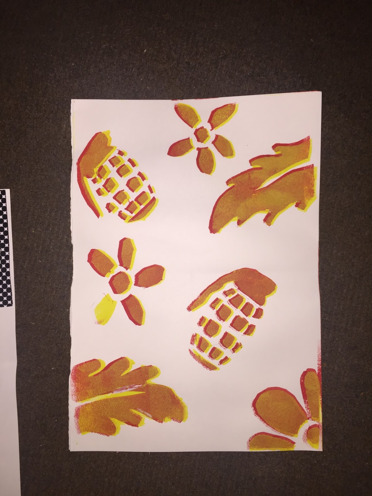
This workshop focused on selecting parts of 3 different typefaces and positioning them in an abstract collage/pattern. The parts are selected on whether we liked them or felt they would work well together. The 3 typefaces we used were: Baskerville Bold , Cooper Standard and Courier bold. All these typefaces had significant differences making the patterns all turn out relatively unique on each print.

one thing i struggled with when creating these prints was actually stencilling them to the page. I would have used card next time as the paint kept making the stencil weak causing un clean lines. However in some cases the grunge effect looks effective.


 Baskerville bold
 Cooper Standard
Courier Bold

My favourite design was defiantly the Courier Bold type , this is because it looks very similar to the work of Keith Haring , know for his simplistic pattern and figure design often using the similar style of patterns to fill blank space.

Wednesday, 22 March 2017

Cinema 4D 3 , Year 2

3D Modeling 

This workshop focused on the 3D modelling capabilities of cinema 4d. I have previously explored basic modelling with shapes and text and also how to generate patters and designs using the softwares vast range of effects however this workshop focused on more advance modelling such as bottles and cans. This is something that will come in handy when creating our own mock ups for packaging or other products.

the first 3d model we created was a can , to create this we imported a path similar to the previous workshop into Cinema 4D , this time we used the lathe tool on the path to create the cylindrical shape. The path gave us an accurate shape of the can instead of creating one from scratch. The lathe tool produced some inaccuracy on the top of the lathe therefore i had to use the point selection tool to stop the overlapping centre. the cans involved us using different textures that gave off a more realistic feel to the model. the main textures we used were legacy reflections , we used layer Fresnel with this to add a noise like texture to the reflection making it less intense.

We then added the image created for the cans label to a texture. The label had to be inverted as it appeared backward when first imported. 

Finally we added lights and shadowing to the surrounding area to give the objects a sense of place. When rendering we used ambient exclusion to add more detail to the cans which benefitted the rendering.

 The bottle was created using the same technique has the can , using the path then using a lathe to create the shape of the bottle. The differences were that we had to use glass textures , these were already pr set materials that come with the software however they are very useful when creating mockups such as this. One thing that proved slightly more difficult was having to use a mask to create the circular label , this involved scaling the texture to fit the bottle perfectly. 

I had to create a bottle cap separate by using paths to create the shape , the ridges in the cap were created using a star. Finally the cap was added to the bottle to create our final rendered product below.
 The box involved setting different faces of an object to hold different images as seen below , used specifically for flat surface mock ups such as cereal boxes.
i feel that my Cinema 4D skills are rapidly developing , hopefully i will be able to use the software with confidence eventually. The 3D modelling will come in handy for packaging design and mockups in the future.

Wednesday, 15 March 2017

After effects 6 - Showreel 2016-2017

Showreel

This workshop focused on us creating a showreel that would show a client quick snippets of all of our pieces of work , this could be adapted to your personal animation skills or in my case just used for my process and production work over the second year in my degree. For inspiration we looked at various showreels from different studios. Before beginning my own show reel i discovered David Luepschen's display of work. This show reel stood out to me because of its smooth transitions and timing with the music , something of which i hope to attempt in mine. 


I felt that i partially struggled when creating my showreel as i didn't feel that some of my designs were strong enough to put in the compilation. This is because the productions were created in such a short space of time giving less space to add detail to some of my outputs. Especially compared to some of my personal work which i feel shows my true animation abilities such as my character rigging experiments.


My showreel consisted of a hand drawn typeface to display important information , i chose bright colours to give off a positive feel to the audience. I used basic transitions as i struggled to find more complicated ways of transitioning into other scenes and slides.

Wednesday, 15 February 2017

Cinema 4D 2 , Year 2

Cinema 4D ,  Generating patterns

After last weeks introduction to cinema 4D we began to explore into more advanced skills within the program. I feel that i gained a pretty good understanding of the tasks however more work needs to be put in as there were that many options and tweaks to make the final outcomes i will struggle to remember them all clearly. The main objective of this task was to construct various images our animations of generative patterns.

The first piece we created involved us starting with a long tube , we then removed the caps to create a hollow tunnel. We then used the twist effect to add a gradual bend to the structure.This was the base for our animation. We then explored further into the texture options. To get the striped tunnel effect we added the checkerboard effect to a texture but reduced the amount of column leaving us with stripes. These stripes gave off a trippy effect as they twisted down the tunnel. The second part of the piece involved creating a share that had the same texture in a different colour , we then added a slight reflectance to the spheres making them look similar to glass. The aim of the task was to make the spheres travel down the tunnel , to achieve this i added dynamics to each shape giving them hard textures allowing them to bounce off each other , we also had to add a low gravity emitter that spawned more spheres into the composition and let them travel down the tunnel.

One thing i found particularly interesting about this workshop in cinema 4D is that you could swap parts of the composition out for something else and they would retain the same settings such as the original square twist i Changed for a flower shape as shown in my animation below.


The second task was to create a generative texture more so than an illusion. we used a similar texture to the previous task however this time i chose to add thin stripes in illuminous colours. This texture was then added to a plane. At this moment in time the texture was still , therefore we added noise to the plane to make it rough , then a subdivision surface modifier to smoothen the edges. To give the plane some life we used the displacement tool which made the texture move in a random pattern . The style of the pattern depended on the projection that we chose , in my case i used the cylindrical option.


The final process for this workshop was a more simple design which used the emitter effect again. This piece involved colouring multiple planes in a post modernism colour scheme and having them rise to create a scene. This output focuses on the emitters settings showing how you can add random generations in speed and direction to get a different design every time they spawned. 


One of my favourite things i learnt from this session is that if you aren't hoary with the patterns you have you are able to pick a different generation seed to give you options which seem to go on forever.

Monday, 13 February 2017

After Effects- Personal Investigation 2

Personal Investigation 2 - Character Rigging 

Something that has always interested me in design and animation is character rigid. This is the technique that allows you to animate artwork for movement or other purposes. This can be done two ways. One of these is using the puppet tool which will bend parts of the character depending on where you pin it , i felt that this way wasn't as suitable for my begin therefore sadly had to go the long way around it.

The method i used to animate my character involved creating each individual part in illustrator and importing to after effects. Once imported i parented all the parts to each other to keep the character together. When i first tried to make my character walk i struggled massively , ending up in my character looking as if he was kicking his face. After some helpful advice i imported an image of the walk cycle to help me keyframe the character. I made sure the the first and last keyframe matched up so i could loop the short walk cycle into a long one saving me a lot of time. 

After finishing this design i was very happy with it and wanted to take it further. I chose to adapt my design for my website to use it as an animated background. I feel that this would add some personalisation to my site and make it a lot more interesting to look at. I also added a cart to my character that had icons of software that i use fall into it from the top of the page. The cart was simply animated and i used the puppet pins tool to make the top path move with my characters arm.

Although this did take up a lot of personal time i feel that it has developed my personal skill level on after effects massively as i wasn't very confident beforehand. The character rigging techniques will also come in handy for the future as i feel slight animation of artwork can make it look very professional and effective 


Friday, 10 February 2017

After effects - Personal investigation 1

After Effects - Personal Investigation 1

After taking part in my after effects workshops i felt that i needed to transfer my skills towards something more personal. I wanted to do this in a simple yet effective way therefore i decided to look into creating some GIFs for my social media using the skills i had discovered in the workshops. I feel that these skills would look well on my portfolio work as gifs are an ever growing popular form of communication over social media. 

When designing my pieces i wanted to keep the animations short but straight to the point , these animations would be looped for smoother flow and because the actual animation was very short.


Wednesday, 1 February 2017

After Effects 5 , Year 2

Infographics and Mapping

The objective of this workshop was to show how information may be displayed through animation , for this we took a route that we would normally take and turned it into a vector ready for animation , we also used a bar chart to display information and experienced with ways we could animate these.

At the beginning of this lecture we started off by looking at inspiration such as The exquisite ant on vimeo by the school of motion. This infographic animation showed how facts and figures could be presented in a clean smooth flowing way. my favourite aspects of this being their suitable use of texture for the animation.


When creating the map infographic i used a previous technique of having the stroke reveal a path. this was achieved by using the pen tool to cover the subject then setting options to reveal. A technique that i learn was that you can flip the order of the key points to reverse the direction using the keyframe assistant tool. after creating this i wanted a small red dot that represented me to move along the line. a new skill that i have learnt is how to get an object to follow a specific path. To achieve this i created the path in illustrator , then when going back into after effects i copped the path into the position tab of the object and it automatically key framed the motion go the object to the specific path.

The next stage of my animation was to create a bar chart that flowed smoothly, to display information. To get this technique we created masks that increased and decreased in size. We altered the anchor points to allow them to extend from the bottom of the chart giving them a rising effect.

Self Publishing 4 , Year 2

Self Publishing - Stencils

This weeks self publishing workshop focused on stencil work. Stencils are commonly used in graffiti and streetward to transfer a complex design to a surface quickly. Graffiti is a form of self expression and is illegal in most places however it is an ever increasingly popular art form. 

Our task was to select a word from a shoe box then create a stencil from it. I picked the word fist however i didn't want to create just a simple fist therefore i added a smashed mobile phone to my stencil to make the image look as if it was rebelling against technology , i feel that the fist is an aggressive image that could be linked to revolution and uprise.

after creating my stencil we used print inks to print the design. Once dry we began cutting out another stencil to overlay on-top of my first design. 'Drown me in your sweet submission' was the phrase i picked , these are lyrics from the stone roses song 'bye bye badman'. i feel that this link in well with my first design as the stone roses first album cover is linked to the french revolution , the lemons were used as the protesters used lemon juice to counteract tear gas.


Personal Research - The Meme

Personal Research - The Meme

The meme , a concept that involves hijacking an idea for yourself in a humorous or controversial way. The internet Meme is the most common form of meme in modern society however there have been famous expels of memes in the past such as Shepard Fairies 'OBEY'. 

My Meme consisted of hijacking an image from popular streetwear brand 'Supreme's look-book for 2017. The brand itself has a massive following and has increased in popularity dramatically in the recent years especially after announcement of collaboration with fashion heavyweight Louis Vuitton. This in mind i hoped that my post would gain a lot of attention.

This seasons collection involved a piece of clothing with the last president Barrack Obama face all over it. The item gained a lot of attention because of its bizarre style however nobody had seemed to notice the obvious... " what if Barrack Obama actually wore this?". I jumped to the opportunity and made it happen using my knowledge of photoshop. Below is the original image i created followed by examples of repots making it go viral through the internet.


My original image of Barrack Obama

1 of multiple re-posts from popular streetwear instagram


The original post to Facebook gaining attention at first

Wednesday, 25 January 2017

Cinema 4D 1 , Year 2

Cinema 4D Basics

This process and production session introduced to the 3D modelling and video software Cinema 4D. This is a very complex software that will take time to get used to due to the capabilities of the program.

First we had to create a logo in illustrator to begin sculpting our shape. We had to backsave the file as an earlier version of illustrator as the Cinema 4D software only supports basic lines and any version of Illustrator over 8 has smart lines which aren't compatible with the software.

After the logo was imported we turned it int a solid shape , we could then adjust the settings to allow the shape to be modified. on my design i edited the caps so that the edges were rounded , other options included bevel,embossing and concave. after adjusting the settings of our shape we began using colour , texture and lighting within our image , i added basic colour to my shape however the software can generate real life textures such as brick and grass for more complex designs. the most complex texture i added was the reflective characteristics to the floor , this gave a grainy reflection off the floor. When i added more light the reflection became clearer , this also created harsh shadows on my design giving it depth.

The finial part of the workshop involved animating through Cinema 4D , this was very similar to adobe after effects and involved setting key frames for the duration of the animation. the final result is below.


Wednesday, 18 January 2017

After Effects 4 , Year 2

Camera skills

Last year we looked at basic camera skills in adobe after effects , we did this by using the camera to move through various font styles to finally end up with a final frame of a phrase or quote that we chose.

The inspiration for this workshop was sourced from a music video of the band MGMT , the music involved the camera panning backwards through a range of scenery and textures to tell a story , i like the video as it had a lot of flow to it and the transitions are very smooth and well thought about.


This workshop focused on more complicated camera movements using a two node camera more so than one node camera. This allowed us to focus the camera on certain areas and not just head on camera angles. For the following task we had to pick something from the surrounding area that we wanted to animate , i felt that creating a building or structure would be too time consuming so i chose to recreate a pigeon. I chose wool textures to give my animation a friendly and approachable style , this is not something i would normally pick for my designs however i feel that it worked well as it kept the animation looking good and to a consistent style. i used layer masking to fit the textures to the shapes and once they were all ready i exported them to Aftereffects to be added to my composition.

When i imported all my layers into the composition i made them all 3d in order to give me use of the Z axis. i then added a top view camera to allow me to arrange the elements of the composition in the correct order. Once everything was arranged i set key points at the start and end of my composition so i could start adding each individual camera movement when navigating through my scenes. I needed to leave big enough gaps between each element to allow smooth camera flow, this involved a lot of resizing images to make the final image as accurate as possible.

As the camera was two node i had two separate paths to tamper with to get the best angles for the final composition. i struggled with this at first but after a while i started to look at it as a pen tool motion , the best camera angels were the ones with the smooth flowing curves , i managed to direct the camera successfully as i added the key frames in-between the start and the end point giving the camera more sense of direction. 


Tuesday, 10 January 2017

Final Brief

Final Brief 

HyperReality 
The Meme
Millennial 


Hyper Reality

We began the lecture by looking at a series of videos that linked to our brief's. The first of which was hyper reality , show in the video below we can see that a hyper reality is an extension on life itself , making something better and enhancing reality. Examples of hyper realities include Themeparks , festivals and virtual reality / video games as these provide pleasure for the participant and are an extension on their everyday life however it is only temporary. the immersive experience is what makes people partake in hyper realistic events , often making them forget about the worries of the world for a temporary escape , but when do people draw the line?


The Meme

The meme is commonly interpreted as the internet meme , a certain piece of digital media that goes viral and is passed from one person to another at an alarming rate. these memes may have humorous or shocking values. Memes are also considered as hijacking an original idea. The definition of a meme is: an element of a culture or system of behaviour passed from one individual to another by imitation or other non-genetic means.

A popular example of a meme and one of which we may not realise is a meme is Shepard fairey's Andre the Giant. Fairey explains in the following video how a simple hijacking of something he found funny quickly turned into a global sensation and became the staple for him creating his own streetwear and art brand OBEY.


Millennial

Millennial generations spans from around 1980-2000 and consists of teenagers and early 20 year olds. Millennial can differer depending on the country due to culture and different upbringings.Many countries have given names to the millennial generations, these include;

Generation Maybe: In Germany, they have been called Generation Maybe, a group who are well educated, highly connected, multilingual, globally minded,
with myriad of opportunities, but who are so overwhelmed by the possibilities available to them that they commit to nothing.


“We are sleepwalking through a networked world of opportunity and feel insecure in the face of the plethora of options ... We no longer know what to do,” 

Generation Serious: It is perhaps these troubles and their concern about the future that lead millennials to be, by and large, a serious generation, less prone to either the wild optimism or hedonism of their forebears, leading Norwegian millennials
to be christened Generation Serious, in 2011. 

Generation Snowflake: A derogatory term for someone deemed too emotionally vulnerable to cope with views that challenge their own, particularly in universities and other forums once known for robust debate. It’s a term used to characterise young adults of the 2010s as being more prone to taking offence and less resilient than previous generations, or too emotionally vulnerable to cope with views that challenge their own.


Wednesday, 7 December 2016

Referencing Lecture

Referencing

Due to receiving our brief on our second essay of the course we were given an extra on referencing as students needed a recap on how to reference and also some questions clearing up , i believe i have a average knowledge of referencing , this lecture proved extremely helpful and answered a lot of questions i held back in my mind.

The lecture started off by identifying why referencing was used , we collectively said it: Prevents Plagiarism , Adds extra marks to your work , Shows valid research , Supports the original text , Makes your work easier to follow and identify and helps your work flow better. I feel that the main two points from this is to show research as without research everything you write could be fictional and not support your question in a professional and organised way. The other reason being that Referencing helps prevent plagiarism , passing other peoples work off as your own is strictly forbidden.

We were given a leaflet at the end of the lecture to guide us when referencing in our essay , referencing help is also available through tutors and through the library.

Software such as Medley is also used to help keep a bibliography when writing our essays.

Self Publishing 3 , Year 2

Zines

"Zine" is short for fanzine. For all intensive purposes, a zine is a cheaply-made, cheaply-priced publication, often in black and white, which is mass-produced via photocopier and bound with staples. Most zines revolve around a music scene of some sort, but others are dedicated to artwork, poetry, cartoons, editorials and short stories. Because zines do not have any sort of corporate backing, and have a very DIY aesthetic.

Our zines that we created consisted of 5 pages , when we opened the zine the designs got larger until you reached the final piece. I thought this was a good idea as it showed variation instead of creating a book format. On each page we had different tasks to complete which mainly involved manipulating self portraits.

Our first page involved cutting up our student identification image and turning it into something unique , i chose to cut out my eyes as they were very heavy due to me being very tired , i replaced these with lines across my eyes that kind of looked like stitches , this gave my image quite a creepy feeling to it. 


My second task was to draw myself , i dont class myself as a strong illustrator however i gave it a go , i don't think it turned out too bad but i wouldn't say it was a very accurate drawing. however i do like the style that i drew it in , instead of trying to get in mass amounts of detail i tried to capture the key features and shapes within my face. I defiantly prefer creating portraits digitally.


The third page was my favourite , this involved a picture of us with out face smushed against the photo scanner , this was then printed out and stuck into my zine , i liked this task as it looked almost surreal , i also uploaded this image individually to social media which got  a lot of attention due to how unique it came across. i feel it worked well as the high quality scanner really captured detail on my face.


I feel that i struggled with this page the most , mainly because i couldn't think of idea that went well in the amount of time we had. This portrait had to be created in the style of Emojis , we had to cut and stick the emojis in a certain way to create a portrait of ourself. i chose to make a stencil on this sheet of emojis and layer a separate sheet behind to provide the colour however this didn't turn out as good as i hoped and looked rushed and unfinished.


My final task was to create a self portrait out of different weights of dots , this gave a halftone screen/Ben Day dot kind of effect , similar to a pop art / Roy Litchensutein kind of effect. I enjoyed creating my portrait out of this as i felt that it was easy to get across the different shades of colour in a persons face and also enjoyed building different parts together to construct more complex shapes , i feel my final outcome was successful and identifiable as my self portrait.


I feel that overall this zine project opened me up to interpreting different styles of working , something which i would like to try in my later projects this year is a more hands on traditional styles of graphic design such as physically making something before turning it digital.

Wednesday, 30 November 2016

InDesign 3 , Year 2

Presentation Skills

The aim of this workshop was to compose a standardised template to use when presenting work to clients. This would be useful as it saves time on creating one from scratch on every project that you receive and also gives your personal representation a sense of professionally , for example if somebody sees your presentations they can tell its yours by the personalisation and consistency in design.

We were to design the template in to sizes , one in A3 as this could still be presented on a screen but can also be printed to hand to the client as a in hand copy. The other template would be 1920 x 1080 pal, RGB , this one would be specifically for widescreen display when presenting to a client on a digital screen.

Personally , even though the task was simple , i struggled to get my head around it as i like to personalise my presentations depending on the client , i felt that a standardised presentation made it feel very generic. I do see the positive sides of creating a template as it saves time , looks professional , and can keep to a theme that represents yourself or design firm and will be recognised by clients , however i feel that this would be best used if i was an established designer. Which at the moment , i am not. 

One thing i found interesting in a guest lecture is that when designing for clients one firm used to make a top trump style card for each client to remind them what they wanted , this included a character designed after them , facts such as the brief , colour schemes , moods , interests and outcomes for the project. i feel that this would be useful as it constantly reminds you what you need to do in a fn and creative way.

When designing my presentation i chose to keep it relatively simple and straight to the point , i didn't want to bore the client and wanted to portray my designs quickly and clearly but also in a convincing and friendly way. I chose an accessible and clear typeface with different weights so i could order  show my information in order of importance. I used the typeface Roboto as it has many styles that can be adapted to suit different clients and create different atmospheres.

The key headings that i chose to include in my template were;

Title page , This included project date , client and other necessary information 

Introduction , This would deliver a brief overview of the project to the client to help them understand my chain of thought

Initial designs , These next few slides would include multiple designs which i feel were good but not quite the strongest 

Final design , The design i felt was best would be brought forward 

Refined design , these next few slides would show variation of this logo and how it could be changed , e.g. colours or slogans added.

Product Placement , Show how the logo will look on advertisements , packaging and other point of sale products.

Final review , Time for feedback on the designs and any additional information the client may require.


Wednesday, 23 November 2016

After Effects 3 , Year 2

Hand Drawn Effects

This process and production focused on creating a hand drawn effect within illustrator , this is an effect i have seen done many times before and is very popular in music videos and short animation , i like this style as it can be adapted to many formats and is also very common in music videos and tv advertisements. Just for One Day by Johnny Kelly is an example of the style we were attempting to get across in our own animation , i like this style as it is simplistic yet very effective and aesthetically pleasing , i like how the simple line drawings flow into each other smoothly creating an easy to follow timeline within the story.


I began by drawing the same drawing 3 times over , this was to get the old style flicker effect when animating our work. after drawing my character i scanned my work in and edited the scan accordingly. once edited i proceeded by importing my jpegs as a sequence , this was made possible due to saving each jpeg as 001 002 003 so the software knew the order of the sequence. once in the composition i changed the settings of the footage so it became a main piece and not just a composition , i then had to loop this sequence 50 times to keep a constant flow of the imagery. i then used the stretch tool to slow the loop as it was originally too fast. Then i drew over the original drawing using the pen tool , i made sure i drew over it in a similar way to how i hand drew it so the path would reveal the original drawing in the same way. Once the path was created i used Generate > Stroke , then edited the settings of the brush size and colour so i could see the path covering the original drawing. After this i selected the set to reveal option which revealed certain steps of the drawing at different parts of the clip. finally i added the multiply effect to the composition removing the white background and allowing me to add a textured background for extra effect.


After finishing this animation i experimented with spherical effects , to do this i created another drawing similar to my last character that would fit the sphere. once i had my animation i added a white background and pre composed my two clips , then i added the CC Sphere effect and toggled the setting to remove shadows to allow my image to be wrapped round a transparent sphere.


After finishing this animation i experimented with spherical effects , to do this i created another drawing similar to my last character that would fit the sphere. once i had my animation i added a white background and pre composed my two clips , then i added the CC Sphere effect and toggled the setting to remove shadows to allow my image to be wrapped round a transparent sphere.

Wednesday, 16 November 2016

Self Publishing 2 , Year 2

Physical Typography Workshop


This workshop involved us using different typefaces to create different styles of prints using only the type. we had to portray a certain mood and feel about the print. this was similar to the indesign workshop however this was all done physically instead of digitally. i enjoyed doing physical work as it is more hands on and different effects that can't be accomplished digitally can be achieved physically.

We looked into designers such as Anthony Burrill , whose work i had previously seen before. Brill used large typefaces and vibrant colours to portray simple messages to the audience. Brill uses classic methods of printing presses to create his prints , a traditional technique which isn't as common. this gives his work an authentic and unique feel.


The 3 fonts we were given to work with were: Gill Sans , Courier New and Times New Roman. we then had to cut out the individual letters and construct an print that contained one of the following phrases we were given , these were;

Lets go dip it low then you bring it up slow. 

What you gone do when I appear?

 Started from the bottom now we’re here.

I’m missing more than just your body. 

Haven’t had a dream in a long time. 

The first phrase i chose was 'Haven't had a dream in a long time' i chose this phrase because its a smiths lyric and i like the smiths. For this print i cut up the word dream and made it larger than the rest of the text. i cut the word dream up because i feel that dreams are hazy and hard to remember , also with parts of the letter missing representing losing the ability to dream.


The next print had the phrase 'Started from the bottom now were here' i placed the lettering of the first half of the phrase at the bottom of the page , then changed the positioning of the second half of the phrase to give the poster personality as if the type had moved by itself and was constantly changing. 


Tuesday, 15 November 2016

Studio Project 2 , Session 2

Greenalls Gin Moodboard

I have decided that i will take part in the Greenalls gin brief which is:

We would like you to choose quintessential British moments that have lasted through time and are still relevant today, and bring this to life in a contemporary way through a piece of creative that has Greenall’s at its heart. 
I feel that this gin has lots of potential and is flexible what you can design , i have previously looked at branding and advertisement for alcohol before and enjoyed doing so therefore i feel that i will be able to partake in this better than some of the other briefs.

My ideas for this project include producing posters for different eras in Britain and highlighting the key moments in the eras and linking them to greenalls gin.

illustrating one key photograph or event and adding gin to the situation 

photo manipulation , adding gin into photographs to make it look like greenalls gin was present.


Friday, 11 November 2016

Seminar 4 , Year 2

Presentation Feedback

This seminar focused on giving feedback from our essay presentation. Personally i feel that my presentation went very well. key things points that i was praised on included:

-Time Management
-Conversing using my own notes and not reading off the screen
-Good use of referencing

We then discussed as a group and found out that most people lacked on time management skills , however after previous praise this did not apply to me.

Things i was to improve on were:

- Layout of my slides , there was no theme or feel and was very basic
- keep my points relevant to the context 
- speak fluently