For our final After effects project was a collaborative piece between all the students in the group. We wanted to create something similar to the video Lantern Fish by Adam Gault. The lanternfish video is a video that displayed illustrations of different deep sea lantern fish , each one with different actions, each one of these actions leads into each other . for example one of the lantern fish would be killed by another and from the fishes remains another fish would appear leading onto the next transition with flow.
For our own videos we had to create a 10 second animation of a fish that just swam across the screen. For my animation i created a pack of Mantarays. I had one Mantaray that was my centre of attention , this is the vector which i added all the key animations to. Although simplistic i felt that adding a pack of Mantarays added to the detail. I added motion paths that made the fish look as if they're swimming.
Once the main path was created i added a sinking boat to the background , this was to add further detail to the animation and make it more identifiable as my own. I created the simplistic boat vector in illustrator so i could easily animate it. In my own animation i had to leave the background blank as it had to be exported to the public drive to be added to the main animation.
One thing about this animation was that i didn't particularly learn any new skills , the animation was fairly simple and didn't require any new skills to create the piece , i would have enjoyed it if i could have learnt a new skill to push my animation further.
The finale for the after effects sessions included all of our 10 second pieces stitched together. This created a piece similar to the lantern fish video. The background retained a constant colour while all the students fishes swam across the screen. I feel that the piece showed how far peoples after effects and illustrator skills had developed massively over the year.
Showing posts with label Process and Production. Show all posts
Showing posts with label Process and Production. Show all posts
Thursday, 21 April 2016
Drawing 6 - Final alphabet
In this session we had to finalise one of our typefaces. i chose my 'Muddy' styled typefaces to be finalised , this involved drawing it up on a bigger scale , making sure all the letters were the same dimensions to retain the style. i felt that this font was detailed enough to take forward as my final design as there was a lot of potential for the font to be adapted. My past designs all inspired this typeface , using a variation of sketches allowed me to have a large amount of choice when picking a final idea.


Once i had finalised my design i proceeded to adapt it to a phrase. this proved to be more difficult as i had to recreate the typeface with no guidance. However overall i feel that each letter worked well together and provided flow through the words. non of the letters looked wrong and out of place therefore creating a successful type style.

The typography workshops have helped me massively and allowed me to start looking into designing my own type , although early stages of this skill i feel that there is lots of potential , and eventually , with time i will be able to create my own typefaces for future projects.

Thursday, 14 April 2016
Cinema 4D 1 - Basics
Cinema 4D is one of the more Untouched softwares , purely because nobody has a clue how to use it and its insanely complicated without tutoring. I myself had looked into cinema 4D for my project 'visualising Sound' therefore had some basic idea as of what was happening on screen and what certain tools did what.
This tutorial was mainly about listening insanely carefully as there were that many items to edit one step wrong and everything fell apart. Our task was Generate a 3D Logo or name in Cinema4D, by extruding a vector created and imported from Adobe Illustrator. I began by typing my name in a font. Once the typeface was selected you could edit the thickness and spacing of the text to get a 3D effect. I played around in the settings for a while before setting on the right size for my task. I wanted to keep it simple so i only used the word Ben. i then added a ground to the text and edited the text settings so there was gravity on the individual letters making them sit heavily on the ground. After establishing some sturdy text i added texture to the ground (matte metallic) and a purple colour to the text. Originally this looked rather dull so i took it bit further and added light. I experimented with different styles of lighting but eventually settled for a spotlight as it provided the best effect on the textures. I found the realtime light interesting though as it acted like the sun and would position itself with whatever time it was on the clock , for example 12:00Pm and the light would be above the subject.
I repeated these steps for another step of text , this time using a stroke instead of block colour making the text hollow. The texture i used was like glass allowing the red light to be absorbed by and emitted by the glass lettering. Examples are shown below.

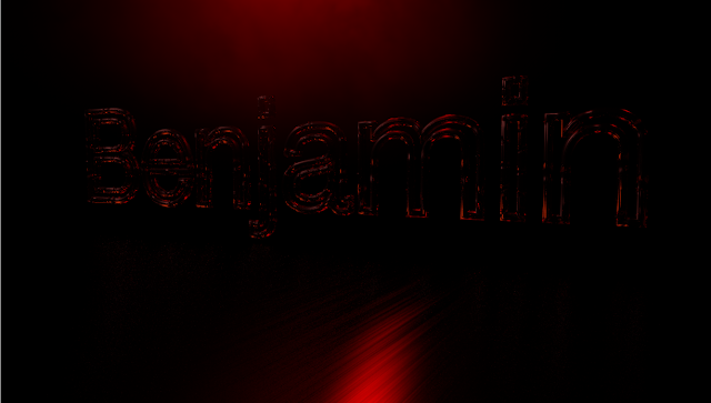
Overall i feel that Cinema 4D is a difficult piece of software to use and will definitely need some practise if i am to use it any further. One thing i would like to explore with it is product design and how you can make mock products such as bottles in the software. This is something i hope to explore in second year.
This tutorial was mainly about listening insanely carefully as there were that many items to edit one step wrong and everything fell apart. Our task was Generate a 3D Logo or name in Cinema4D, by extruding a vector created and imported from Adobe Illustrator. I began by typing my name in a font. Once the typeface was selected you could edit the thickness and spacing of the text to get a 3D effect. I played around in the settings for a while before setting on the right size for my task. I wanted to keep it simple so i only used the word Ben. i then added a ground to the text and edited the text settings so there was gravity on the individual letters making them sit heavily on the ground. After establishing some sturdy text i added texture to the ground (matte metallic) and a purple colour to the text. Originally this looked rather dull so i took it bit further and added light. I experimented with different styles of lighting but eventually settled for a spotlight as it provided the best effect on the textures. I found the realtime light interesting though as it acted like the sun and would position itself with whatever time it was on the clock , for example 12:00Pm and the light would be above the subject.
I repeated these steps for another step of text , this time using a stroke instead of block colour making the text hollow. The texture i used was like glass allowing the red light to be absorbed by and emitted by the glass lettering. Examples are shown below.


Overall i feel that Cinema 4D is a difficult piece of software to use and will definitely need some practise if i am to use it any further. One thing i would like to explore with it is product design and how you can make mock products such as bottles in the software. This is something i hope to explore in second year.
Thursday, 24 March 2016
Drawing 5 - Constructing Alphabets
This session involved looking further into typography by producing three different rough sketches of typefaces. we would then choose to finalise one of these ideas and produced a refined version of the typography for our final typography session. i enjoyed this task as it allowed me to produce some quick fire typography ideas. this session allowed my mind to work fast and draw freely as the sketches only had to be rough. I made sure the designs i produced were very different styles so i had lots of variation to work with.
 My first rough typeface was very circular based. i wanted to keep all lettering within a 3x3 gridded circle to retain the style. I enjoyed creating this font as it was very different to conventional typefaces. one thing that i struggled with was creating this type quickly producing each letter , this proved to be fairly difficult and took quite long to create. i particularly struggled with getting each part of the circle equally spaced to retain the shapes consistency therefore i will most likely not be continuing with this font style.

This typeface is a more simplistic Sans serif style , my aim was to not connect any of the parts of the type and use only straight lines and curves to create a sleek looking layout. This type reminds me of something that is stencil based and could be spray painted onto a wall. this font was a lot easier to produce than previous typefaces and i feel that it could be adapted into becoming quite a consistent lettering style.

This is my final typeface that i produced for the quick sketches , i wanted to try a more cartoon style typeface. this font gives off a muddy/slime feel to it , i added lines that made the text look as if it was melting in places. i feel like i will take this font into the final stages as i get the feeling that it could be adapted to different pieces and made into a more refined typeface. when creating it in final form i do need to retain letter sizing and a more consistent build in order to give it its best effect.
this task allowed me to work freely , under no pressure and really get a feel for type design. this was key as been new to type i needed time to get inspiration and explore possibilities. one thing i would like to do is take my type digital and start to play around with it as a vector image.


This is my final typeface that i produced for the quick sketches , i wanted to try a more cartoon style typeface. this font gives off a muddy/slime feel to it , i added lines that made the text look as if it was melting in places. i feel like i will take this font into the final stages as i get the feeling that it could be adapted to different pieces and made into a more refined typeface. when creating it in final form i do need to retain letter sizing and a more consistent build in order to give it its best effect.
this task allowed me to work freely , under no pressure and really get a feel for type design. this was key as been new to type i needed time to get inspiration and explore possibilities. one thing i would like to do is take my type digital and start to play around with it as a vector image.
Friday, 11 March 2016
After Effects 5 - 3D Type
This session was a further development from the last session that looked at a specific typeface. The session began with a video to give us inspiration for our pieces that we were to create. The video 'BBC Today - Stephen Hawing' shows how the camera can be used in after effects to give a sense of motion and atmosphere to the animation. In the Stephen Hawking sequence the camera travels through different words and phrases while also taking us on a journey through , what it looks like , a blackboard full of work.
For my own piece i decided to use lyrics from The Smiths song : Still Ill. I didn't try create a specific atmosphere for my own piece as i wanted to focus my attention on learning the new skills with the 3D camera. Before finalising my design it had a very messy feel , i couldn't get my text to align in the final frame due to the camera pacing through the text too quickly. I solved this problem by working backwards and arranging the text before adding the 3D effect.
I felt that the alternative above view came in very handy when creating the animation as you could see the exact motion path of the text as it moved throughout the text. The camera tool came with a series of transformations just like shapes and vectors do. These included options such as Depth of Field , Positioning and zoom.
My own animation consists of the camera moving backwards through the text , i used a depth of field to create an atmosphere when the text passed close over the camera. I used different weights of text to draw attention to specific words. I added the flip transformation to the word 'Mine' to draw attention to it. My favourite part about the animation is how it all sets in to one neatly arranged grid.
If i was to improve this animation i would add a background with a texture as it would add add more of a feel to the animation due to it been basic colours such as black and white. I feel that a photographic or textured background would work effectively , preferably one that would relate to the song.
For my own piece i decided to use lyrics from The Smiths song : Still Ill. I didn't try create a specific atmosphere for my own piece as i wanted to focus my attention on learning the new skills with the 3D camera. Before finalising my design it had a very messy feel , i couldn't get my text to align in the final frame due to the camera pacing through the text too quickly. I solved this problem by working backwards and arranging the text before adding the 3D effect.
I felt that the alternative above view came in very handy when creating the animation as you could see the exact motion path of the text as it moved throughout the text. The camera tool came with a series of transformations just like shapes and vectors do. These included options such as Depth of Field , Positioning and zoom.
My own animation consists of the camera moving backwards through the text , i used a depth of field to create an atmosphere when the text passed close over the camera. I used different weights of text to draw attention to specific words. I added the flip transformation to the word 'Mine' to draw attention to it. My favourite part about the animation is how it all sets in to one neatly arranged grid.
If i was to improve this animation i would add a background with a texture as it would add add more of a feel to the animation due to it been basic colours such as black and white. I feel that a photographic or textured background would work effectively , preferably one that would relate to the song.
Thursday, 18 February 2016
Drawing 4 - Inspiring type
Moving on from the object drawing we now started to look into typography workshops. This session involved inspiring ourselves to create different styles of type , eventually leading into creating our own alphabet. The session began by picking different illustrations and photographs to base our type on. The image i picked was an illustration of a man with psychedelic hair. I chose this as i felt there was a lot of potential for development , the hair provided flow and could be morphed into various shapes and forms.
We were given the letters ANESG to work with as they provided variation. i used the strands of hair to build up each letter , i made sure they flowed well and retained the style of the original illustration. I then began to adapt the hair to the illustration and started to use typography as the hair of the figure. I feel that one thing i would improve with this piece is colour , the colour adds to the psychedelic feel of the illustration , providing the vibrant characteristics. My type lacks this but could be easily adjusted. My type feels relatively messy in these stages as typography is a new thing that i have done before and never gone into it with this much detail.
In this stage my typography was only an experiment , i favour sans serif fonts as i feel they look cleaner however in later stages one of the things i hope to explore is serif fonts , mainly because i think they are more skilful to produce.

We were given the letters ANESG to work with as they provided variation. i used the strands of hair to build up each letter , i made sure they flowed well and retained the style of the original illustration. I then began to adapt the hair to the illustration and started to use typography as the hair of the figure. I feel that one thing i would improve with this piece is colour , the colour adds to the psychedelic feel of the illustration , providing the vibrant characteristics. My type lacks this but could be easily adjusted. My type feels relatively messy in these stages as typography is a new thing that i have done before and never gone into it with this much detail.
In this stage my typography was only an experiment , i favour sans serif fonts as i feel they look cleaner however in later stages one of the things i hope to explore is serif fonts , mainly because i think they are more skilful to produce.

Thursday, 11 February 2016
Photoshop 1 - Basics
Photoshop is one of my strong points within graphic design as i have self taught myself and been using the software since high school. Unfortunately on the day this session was held i was ill therefore i have had to catch up and produce the work in my own time. Photoshop is the software used mainly for working with high resolution images. Unlike Illustrator , photoshop works in Bitmap therefore scaling an image will result in lower quality resolution. I feel that photoshop tools are easier to locate and get the hang of , although most of these tools are present in illustrator they work slightly differently or are hidden in many of drop down menus.
Our first task was exploring the different colour modes of pictures. This was done through the Image > Mode > Adjustments then selecting an option. We first changed an image of our choice to greyscale.


Our first task was exploring the different colour modes of pictures. This was done through the Image > Mode > Adjustments then selecting an option. We first changed an image of our choice to greyscale.

After changing the colour to grayscale the menu opened up the duotone option. This setting allowed two-four colours to pass through the image , acting like a filter. This would add a slight tint to the image making it more interesting than just black and white. Other effects we looked at was Hue and saturation which would change the colours of a whole picture , for example you could make a lemon turn purple without ruining the image. Levels and curves also came in useful for editing photographs as you can alter how intense certain colours were in the image.

Our next task was to create a non destructive self portrait. We achieved this by using different layers to merge a picture of ourselves with objects or landscapes. I started out by picking a suitable image of myself to merge with another image. I then duplicated the image and placed a forrest scene picture between the two pictures , this was the image i was going to blend with my self portrait. To blend the image i used a rubber with 0% hardness so i could feature away at my portrait that would slowly expose the trees into my face.

Finished Piece
Thursday, 21 January 2016
After Effects 4 - Typography Facts
Previous animation sessions have focused specifically on character design , for this task we had to pick our favourite type face and create a short informational piece about the typeface. The typeface i chose to research was 'Roboto' , i chose to use this font as i used it in my first project and instantly fell in love with it , my favourite aspect of the font is that it is available in so many different weights and styles.
Roboto is a sans serif font that was created specifically by google for the android operating system. This font style has been used in thousands of mobile devices and android products. Google describes the font as "Modern , yet Approachable" and "Emotional".
My aim for this piece was to create an animation that flowed into each key scene smoothly , i felt that this was essential to my animation as simplistic type isn't very interesting to look at on its own. this session allowed me to combine my knowledge of animating shapes with keyframes and animating type to create a more advanced piece of work.When choosing colours i stuck to black and white for the main sequence , however when mentioning 'google' i used the specific colours of each letter to add characteristics to the text.
Originally i had difficulty trying to make the colours flash up separately for the word Google so i settled on bringing all the colours in all at once. Although i seemed help asking how to do this it proved to be too complex for the amount of time i had to complete the piece.
Towards the end of the animation i used the same shade of green that the android branding uses for their 'Android' character, i felt that adding this character would give the animation some more personality , making it more interesting for the audience and providing a direct link to android.
Illustrator 1 and The Creative Cloud - Basics
This session was an Introduction to the Creative Cloud as a whole , We started off by creating an account on the creative cloud , in my case i already had one. This was to show the power of the cloud and how it could link all devices together. We devoted our attention mainly to the Adobe smartphone apps , such as Adobe Capture; Adobe capture is an app that image traces photographs and sends them directly to the cloud for you to use in photoshop or illustrator , this is useful as you can see what images will look like as a vector while on the go. This app proved useful to capture inspiration. Another useful feature of the app was that you could photograph and object and it would allow you to import it as a brush stroke , making different types of patterns when using brush tools in photoshop or illustrator. Another useful tool that adobe capture provides is the ability to photograph a subject and sample a selection of swatches from the photograph. This is very useful when creating colour schemes that need to relate to the subject or giving a piece a specific feel. This application can also help inspire the colour range and channel your mind into looking into different schemes.


We then moved onto illustrator skills , i feel that illustrator definitely isn't one of my strong points in the course therefore i was excited to listen and learn about the softwares potential. I had basic knowledge about some tools such as the pen tool and other vector tools. We began by importing an image of our choice to the dartboard. I chose a photograph of myself as it was easily accessible. We then proceeded to use the image trace tool , this of which i had used before , however i learnt that they're other options when tracing such as 3 colour , 6 colour and low fidelety image trace options. all of these allowed my photo to have a unique outcome with many potential for editing.


We then moved onto illustrator skills , i feel that illustrator definitely isn't one of my strong points in the course therefore i was excited to listen and learn about the softwares potential. I had basic knowledge about some tools such as the pen tool and other vector tools. We began by importing an image of our choice to the dartboard. I chose a photograph of myself as it was easily accessible. We then proceeded to use the image trace tool , this of which i had used before , however i learnt that they're other options when tracing such as 3 colour , 6 colour and low fidelety image trace options. all of these allowed my photo to have a unique outcome with many potential for editing.
after making my photograph become image traced we looked at other creative cloud software like 'Adobe Typeset' , this software was basically a font extension book which provided thousands of developer made typefaces that you can download to your devices via creative cloud.

I feel that my final image turned out well as i used all the skills that i have been taught in todays session. I found this session extremely helpful as it allowed me to brush up on my illustrator skills , something of which i haven't had time to do yet. I hope to look into illustrator in further sessions and learn some more advanced techniques.
Thursday, 17 December 2015
InDesign 3 - Interactive PDF
Our final Indesign tutorial showed us how to create interactive PDF's , this was an extension on generic pdf files as the interactive ones can contain internal hyperlinks , videos and buttons to create a different viewing experience. Our task was to create a PDF about music , specifically looking at Count Baise and Jazz.
I began the task by reconstructing an old percussion album cover on illustrator , we did this as we were to use it as our front cover , however the original image was far too low resolution. another reason was that changing it into vectors would allow us to link in buttons to the PDF. When creating the button i added a drop shadow that would activate when the button was hovered over so the user would identify the internal hyperlink.


I began the task by reconstructing an old percussion album cover on illustrator , we did this as we were to use it as our front cover , however the original image was far too low resolution. another reason was that changing it into vectors would allow us to link in buttons to the PDF. When creating the button i added a drop shadow that would activate when the button was hovered over so the user would identify the internal hyperlink.

This would link the reader to another slide of information , taking them through the pdf presentation in a more unique way to the conventional next button way. The slide that this led onto was about Count Baise , i didn't put any information in the text boxes , however i learnt about the placeholder text tool that would fill the box with random words to fill the page , i feel that this tool would be useful when creating a mock up for a project.

The final step in the interactive text was to add the swing of change video to the PDF. I encountered a lot of problems with this step even though it was simple to do , i asked the tutor if there was a reason why the software would not place the video however we were unable to solve the issue. But to place a video in the indesign document you follow the same steps as you would for placing an image. when the user clicks on the video the video will activate and play. this would be useful when displaying animations we have created on a PDF for deadline hand in's.
Friday, 11 December 2015
After effects 3 - Character
This after effects session was based around creating a character using vector shapes to animate. We initially had to find an image from the internet and use image trace to change the shape into a vector or create one from scratch.
I chose to create a character from scratch in illustrator , i felt that this was a good starting point for me as choosing an existing character would take too long as i wouldn't know what to pick. My character was a floating head that multiplied using its body parts. As this was one of my first few weeks using after effects i felt rather inexperienced therefore had to stick to using simple effects when using the keyframes. The main two transformations i used were the opacity key and the location.
One thing i struggled with when creating this animation is the motion paths of the character as they constantly kept overlapping and ruining the sequence.i eventually solved this by taking more time to analyse the timeline , plotting my keyframes more precisely so the timings were exact.
As a final touch to my sequence i added some moving clouds as the background , i felt that was relevant as the heads i created had no body to situate them on the ground. The floating heads outcome now looked rather trip. I felt that the moving clouds swell as the heads worked well as it added a sense of motion to the piece , making it more detailed.
After the session had finished i felt a lot more confident with after effects , feeling like i could start to look into the more complex pieces in the sessions to come. although the animation was basic i feel that it has set foundations for my skills to develop over time. This session has also made me more confident with illustrator as i mainly worked on photoshop before the course.
Heads by Ben Moulson
I chose to create a character from scratch in illustrator , i felt that this was a good starting point for me as choosing an existing character would take too long as i wouldn't know what to pick. My character was a floating head that multiplied using its body parts. As this was one of my first few weeks using after effects i felt rather inexperienced therefore had to stick to using simple effects when using the keyframes. The main two transformations i used were the opacity key and the location.
One thing i struggled with when creating this animation is the motion paths of the character as they constantly kept overlapping and ruining the sequence.i eventually solved this by taking more time to analyse the timeline , plotting my keyframes more precisely so the timings were exact.
As a final touch to my sequence i added some moving clouds as the background , i felt that was relevant as the heads i created had no body to situate them on the ground. The floating heads outcome now looked rather trip. I felt that the moving clouds swell as the heads worked well as it added a sense of motion to the piece , making it more detailed.
After the session had finished i felt a lot more confident with after effects , feeling like i could start to look into the more complex pieces in the sessions to come. although the animation was basic i feel that it has set foundations for my skills to develop over time. This session has also made me more confident with illustrator as i mainly worked on photoshop before the course.
Heads by Ben Moulson
Thursday, 26 November 2015
Drawing 3 - Object
Moving away from structure drawing we focused on smaller objects. For this task we were each assigned a table to sit around , these of which contained different objects played out in various ways. Our aim was to draw with as much precision as possible , keeping the objects to a certain scale if possible. One of the first drawings i produced was a 'measured drawing' this is where you draw the objects in relation to another object for sizing references. In my case i chose to draw the stack of objects in relation to the size of my pencil when held up next to the object from my position. this allowed me to have certain reference points as to where each object should begin and end.
I felt that my drawing ended up being rather messy however it was a correct measured drawing and was drawn in perspective with the pencil using reference points. I think one thing i struggled with is that the top object had quite a complicated shape which made me ore reluctant to getting stuck in drawing it.


I felt that my drawing ended up being rather messy however it was a correct measured drawing and was drawn in perspective with the pencil using reference points. I think one thing i struggled with is that the top object had quite a complicated shape which made me ore reluctant to getting stuck in drawing it.

The next table i was allocated to had lots of large typography pieces scatted around the table in different variations. with these pieces i wanted to start adding colour variation to show some tone in the objects. I felt that i struggles with the typography table as the shapes seemed to be all rather complex , i felt that the angles were very hard to make exact. for example the G that is positioned onto of the G doesn't look as if it sits as smoothly as it should. this was the table that i spent the most time on proving it to be rather difficult. if i was tottery this again next time i think would pick less complex type , also picking different colours for the tone as they don't suit very well. shadow and tone would be one of the skills i would like to work on further in the future.

Other experiments included drawing with crayon , i attempted to draw the glass sphere in crayon as i felt it would create a glass effect with the shading being darker towards the edges and the light being focused around the centre. i liked this experiment as it was pleasant to use something to draw with that was different from marker and pencil. i feel that crayons bring out a nice range of colours that people neglect.

Thursday, 19 November 2015
After Effects 2 - Book promotion
The second after effects workshop showed us how to link our frames together that we created in adobe photoshop. It took me a while to get the hang of this as i had 83 individual frames which all had to fit together in 10 seconds.
I struggled to use After effects slightly as it was a very different interface as to what I'm used to using when designing print based media. I feel that in this session we were focusing mainly on creating a basic animation but using After Effects to stitch it together. We didn't focus on many skills that came specifically from the software , only basics such as: audio control , Opacity levels and creating solids for frames.
Personally i felt that my animation was successful and gives a basic brief of what the book is about via the visuals. I feel that it worked as i used a lot more slides to create my animation as oppose to the 10 slides we were given to work from as a basic. However i do feel that there could be a quicker route around animating certain parts in After Effects therefore i am eager to see how this could be done. this is what we will be working on in the next workshop session using simple vector characters.
Below is my Animation that is currently uploaded to Vimeo.
Thursday, 12 November 2015
Further Skills- InDesign
Within workshop week i caught up on the InDesign session that i missed a week ago due to a lecturer being absent. I really enjoyed this session as it showed me how to used some more advanced skills within InDesign. We mainly focused upon two page spreads and the techniques used to create a unique looking spread.

Above is an example of the double page spread that i created in this session. One of the main techniques i used when creating this piece was how to type along a certain path or shape , that technique is how i created the left hand page. On the left hand page we also learnt more advanced options to edit text with , and how instead of creating separate boxes you can alter the layout using one single text box. The Left hand page then leads onto the right page creating leading lines for the eyes. I then used the type in text tool to create the circle which looks like the ball of yarn that the cat is playing with.
We were shown that you can also import images and items from other adobe software (although i already knew this it was a handy thing for the group know). This is how we got the cat onto the document. We imaged traced pictures of animals and expanded them to create an editable vector image then exported them to the InDesign package where we could use the shape to our advantage. Other tools we were shown was the path finder tool and how it could be used to split objects or in this posters case wrap text around the image.
If i was to improve this poster i would edit the layout of the text more as i feel it looks very basic , however i didn't have enough tine therefore i left it fairly basic.

Afterwards we were shown how different settings on Adobe Photoshop can effect an image (Above). Starting from top left and through to bottom right;
RGB Colour - Used for screen display , colours will be vibrant but will differ when printed as RGB is used for display.
CMYK Colour - Used when printing CMYK colours are usually slightly darker than RGB and are used specifically for printing. CMYK stands for Cyan , Magenta , Yellow and Key (black).
Duotone Colour - This effect has been created using InDesign where you set the colour to only let specific colour of an image through. In this case the colours are black and red therefore it has made the image look completely red with some shading of the house still visible.
Greyscale Colour - Greyscale colour is just a more technical way of saying Black and white , Only black and white shades of colour will be visible in this mode.
Halftone Screen - Halftone screens are commonly used in screen printing however they can also have good effects visually on print media. The screen is made up of different shapes which you can choose on photoshop which the thickness of the lines creates the quality of the print.
Pantone colours on Halftone - I added two Pantone colours to the Halftone screen to create this Pop Art styled vibrant image , one of the colours substituted the white background and the other replaced the white giving me the vibrant effect.
Pantone is a standardized color matching system, utilizing the Pantone numbering system for identifying colours. By standardizing the colors, different manufacturers in different locations can all reference a Pantone numbered color, making sure colors match without direct contact with one another. Pantone Colours cannot be printed unless the code is entered manually to the printer.
Below are Examples of posters I made using the Pantone colours and there codes for printing:


Thursday, 5 November 2015
Drawing 2 - Interior
Opposite to the previous session , we now began with interior drawing , our task was to pick a location within the creative arts building and draw what we saw from our perspective using a range of techniques and drawing instruments. For my location i chose to situate myself on a high point , looking through the glass barrier out into the rest of the creative arts building , i thought this was a perfect able as it captures the linear structure of the building , i also felt that it had the most potential for shapes to be created in the building. In this task we were pushed to add tonal shade values and colour to our piece to distinguish them form a generic pencil drawing.
Below is my interior drawing from the creative arts building. I began by using pencil to sketch the rough outline of the structure. Once finished i went over these line using a thick finaliser to add weight to certain lines allowing them to stand out and define the build more than other less important lines. After i added a tech of shadow to give the building depth and finally an element of colour to define different parts of the building such as blue for glass.

Below is my interior drawing from the creative arts building. I began by using pencil to sketch the rough outline of the structure. Once finished i went over these line using a thick finaliser to add weight to certain lines allowing them to stand out and define the build more than other less important lines. After i added a tech of shadow to give the building depth and finally an element of colour to define different parts of the building such as blue for glass.

Personally i feel that i struggle with these drawing tasks as it is something i haven't really pursued when designing , i prefer to make quick simplistic sketches than go into detail. Although i feel that my skills are slowly improving there is still a lot i need to learn. hopefully the future sessions will open me up to different drawing styles and ways of thinking when using drawing instruments. i feel that having more time will allow me to express my creativity more.
Thursday, 15 October 2015
Blog Setup / Vimeo Account
This process and production session involved initially setting up our blog to allow us to start documenting about our Theory , Process and Production and Studio lectures. In this session we also begin to start our small animation about a book of our choice and set up a Vimeo account to show it on.
We created our Blogs using Blogger , which is run through Google , other potential sites we could have used were Wordpress and Tumblr however they are all more technical than blogger so we used it to get our posts up and published as soon as possible. We were shown how to lay our blogs out then were given time to customise it to how we wanted it to be presented. Although mine is nothing special in the design aspect of things it is still clear and presents information easily. The 3 main items we had to blog about were Process and production , Contextual/Theory and Studio sessions. As well as anything personal that we think will fit in , e.g. videos , book , exhibitions and artists that may link to my work.
My Blog ( You're on it )
We then set up our vimeo account which literally involved putting in an email and password so didn't involve any serious design aspects like blogger. After setting up our Vimeo account we were given the task to think of a book we enjoyed , in this case i picked A Clockwork Orange - Anthony Burgess (1962). Although unfinished yet my animation consisted of the iconic Clockwork eye emerging on the page and leaving swiftly. I wanted to make my animation like this as i felt that it would allow the audience to identify what the Book was without seeing the title. In my next sessions we will use After effects to string our frames together and hopefully create a successful animation.
Thursday, 8 October 2015
Modernist Posters - InDesign
Today we were introduced to the InDesign package from Adobe CC. I haven't used InDesign before today so this software was both new and interesting to learn. From the first moment i used the software I could see that the interface was very similar to Illustrator therefore I could find some of the useful tools rather quickly.
At the beginning of the tutorial we started out with all the basics on how to create shapes, fill colours, stroked and using other tools such as the text and pen too. When we looked at the text tool we looked into how to change fonts, size , spacing and other
techniques such as inserting placeholder text which can come in very handy in later work. One of the tools i found most useful was the step and repeat tool which was used to quickly copy shapes and patterns instead of having to constantly re-draw or duplicate layers. We were given a selection of posters in which we had to recreate some of them.With the Package having various similarities to Adobe Illustrator meant I didn't feel too lost in re-creating a poster, therefore , I decided to go home and re-create my own using the information we were given this afternoon.
Below are examples of the posters we were given to re-create


 |
| First Poster When creating this first poster I only used the rectangular tool to create the layout. This poster is a combination of thick and thin rectangles with no other complications. quite simple really. I used sample text to add some literature to the page just to give it some sort of character. I chose a cool blue scheme as i felt it made the poster look more calm and welcoming. I also experimented by using the dodge effect on the squares to get the opaque overlay effect. |
 |
| Second Poster This was the second poster i created. I started out by experimenting with the text box tools and realise i could distort the shape of the box and the text would follow the shape. This got me thinking that instead of using a shape tool i could use the text to create the shed instead. I settled with the triangle shape as when i mirrored it it resembled similarities to a paper plane. Hence why i used the title P.Planes. I then themed my poster around the aviation , i added jet streams made out of words and an American flag to give the background some characteristics. Although my skills are still very new within InDesign i feel that they are quickly progressing and with more tutorials InDesign will become a powerful tool within the course. |
Thursday, 1 October 2015
Drawing 1 - Location
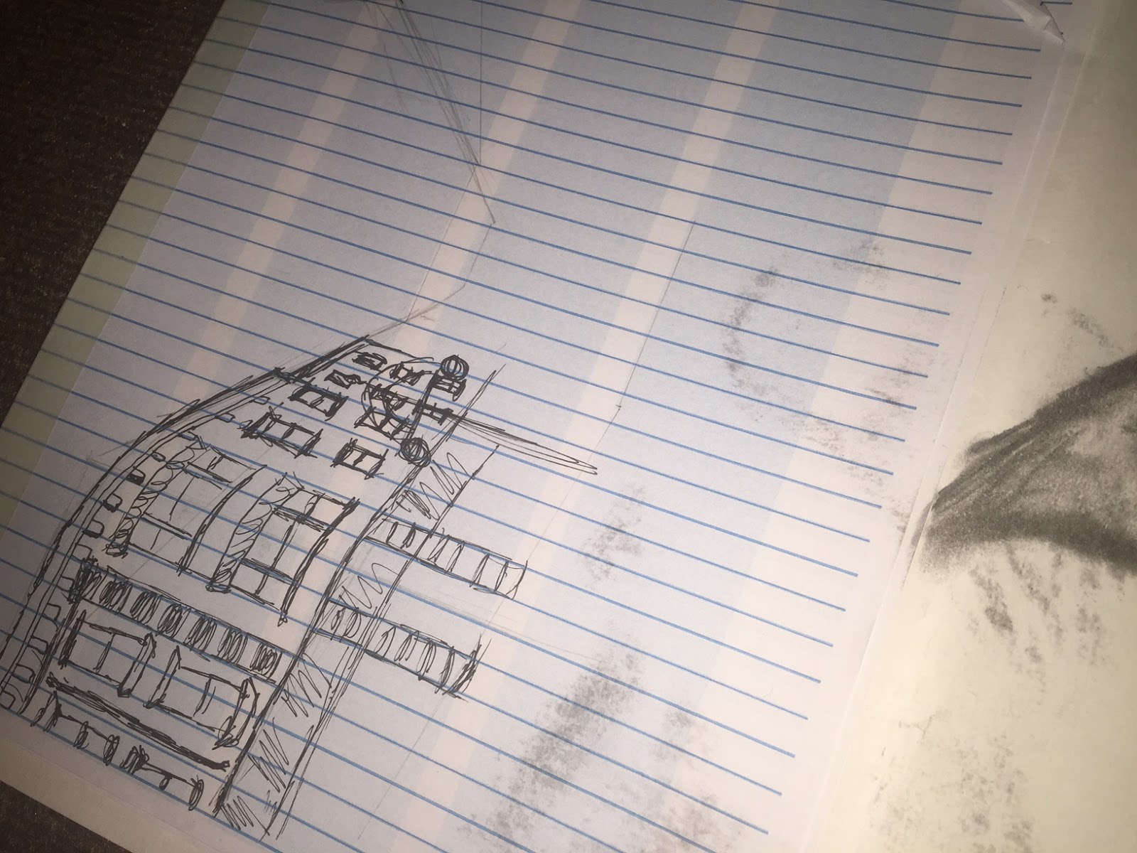
In the first Process and production task we were set out to produce a series of location drawings around Huddersfield town centre. These drawings could be created using multiple tools that we were given to use such as: finalisers , pencils , Pro markers and charcoal. We were also given an A2 sized art board to carry with us , this art board provided a sturdy drawing surface for us to work effectively in all locations we were given.
Locations we traveled to included;
- Market and Piazza
- Gothic Quarter
- New Street shopping area (Primark)
Subjects we were asked to draw included;
-Line drawing study, featuring perspective.
-People and places
-Type in context
-Skylines
-Reflections
-Architectural themes
 |
| Perspective Drawing |
 |
| Movement Drawing |
In this image i looked specifically at the Coffee cali shop front , i chose this area as it seemed like a good location to draw movement. I first sketched the shop front onto one side of tracing paper then waited half an hour before sketching it again. this shows the difference in movement among the sample space over half an hours time. As you can see on the image above people have moved and populated the other spaces around the shop front.
 |
| People Drawing
In this drawing i didn't specifically chose people to sketch but instead i chose a pigeon as they were a common subject around the town centre and all looked very similar. For this drawing i experimented by using charcoal for the first time. I felt that the material was fairly easy to use and worked effectively when mapping shadows and areas that required mass shading. I would like to work in charcoal more often as i feel that it is one of the instruments that gets left out.
|
Subscribe to:
Posts (Atom)