Today we were introduced to the InDesign package from Adobe CC. I haven't used InDesign before today so this software was both new and interesting to learn. From the first moment i used the software I could see that the interface was very similar to Illustrator therefore I could find some of the useful tools rather quickly.
At the beginning of the tutorial we started out with all the basics on how to create shapes, fill colours, stroked and using other tools such as the text and pen too. When we looked at the text tool we looked into how to change fonts, size , spacing and other
techniques such as inserting placeholder text which can come in very handy in later work. One of the tools i found most useful was the step and repeat tool which was used to quickly copy shapes and patterns instead of having to constantly re-draw or duplicate layers.
We were given a selection of posters in which we had to recreate some of them.With the Package having various similarities to Adobe Illustrator meant I didn't feel too lost in re-creating a poster, therefore , I decided to go home and re-create my own using the information we were given this afternoon.
Below are examples of the posters we were given to re-create
 |
First Poster
When creating this first poster I only used the rectangular tool to create the layout. This poster is a combination of thick and thin rectangles with no other complications. quite simple really. I used sample text to add some literature to the page just to give it some sort of character. I chose a cool blue scheme as i felt it made the poster look more calm and welcoming. I also experimented by using the dodge effect on the squares to get the opaque overlay effect. |
 |
Second Poster
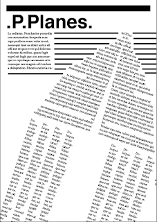
This was the second poster i created. I started out by experimenting with the text box tools and realise i could distort the shape of the box and the text would follow the shape. This got me thinking that instead of using a shape tool i could use the text to create the shed instead. I settled with the triangle shape as when i mirrored it it resembled similarities to a paper plane. Hence why i used the title P.Planes. I then themed my poster around the aviation , i added jet streams made out of words and an American flag to give the background some characteristics.
Although my skills are still very new within InDesign i feel that they are quickly progressing and with more tutorials InDesign will become a powerful tool within the course. |


