Monday, 26 October 2015

Typography Seminar

This seminar consisted of each person in the session being given 3 post-it-notes and given the task to design a typeface for the 3 letters we were assigned. I feel that typography is one of my weak points within my studies therefore it would be good to get a different perspective of what everyone else think of it and how they approach the typography task.

The letters i were given were Q R and S , it took me a while to establish an idea for these but eventually i settled on creating the letters out of basic shapes instead of drawing some kind of funky 3D text. i tried my best to make the 3 letters easy to read but detailed in the style they were produced. 


As you can see above my 3 letters flow into each other by one part of the shape being present in the other letters. If i was to improve this design i would make the pieces of each letter slightly bigger as they were quite small and flimsy and took a while to arrange correctly.

After everybody finished their pieces we arranged them into a typography alphabet which displayed the different designs to the rest of the session , i felt that this was useful as i would be able to take inspiration from this.


Friday, 23 October 2015

Yorkshire Sculpture Park

For one of our studio sessions this month we visited The Yorkshire Sculpture Park (YSP). Although it was pleasant to get out and about to shoot images for my primary research i felt that the location wasn't ideal as my sense of place project is very city based. However it did provide a alternative view on how i could take this project through a different route. 

Part of the park that stood out to me was the Rob Ryan : Listen to the world exhibition. Rob Ryan creates intricate creations out of cut and folded paper which is a very difficult and unique technique. The pieces that stood out to me were cuttings of villages and structures that looked almost like maps. These were relevent to my project as they were very similar to vector images that could be used to create a simplified map. I like how Rob Ryan creates his work as they are more of a physical finished piece which can be held and interacted with making it more interesting than a standard print. I also like how if a light is shone onto the work it creates a shadow in the shape of the art , this effect could be used to increase the size of the work onto a wall or object.


Pictures of us at the sculpture park


Thursday, 22 October 2015

Urbanised - Film


In this lecture, we were shown Urbanised (2011) a documentary film by Gary Hustwit. The productions message was to "change people's ideas about something that already exists", and to show the use of architecture and how it can be adapted to suit the rapid development of population and culture within the modern world.


The film began with a voice over, stating: 'everything we see has been designed and planned'. we were then presented with several unique locations; Copenhagen, New York, Chile, Brazil, Detroit, Brighton, Cape Town, Stuttgart and New Orleans.These were all key locations where architecture had influenced the place and created significant new change to the location. For example in New Orleans houses were severely affected by Hurricane Katrina, so a lot of the land that was being built upon had no set plans, as this was originally not meant to be un-occupied land the city allowed  architectures to have a lot of fun with the plans, because there was no requirement to be met or no specific way how any structure should look.

Below are some of the notes i made during the film: 

Monday, 19 October 2015

Convergence


This lecture focused specifically on Convergence. "the process or state of converging". Convergence means is to change something or to make it a little different.

We were given a mixture of answers/opinions of what convergence was from different people. Here are some of the statements that were said:

"Convergence is an ambiguous term used by various disciplines to describe and analyse processes of change toward uniformity or union. Its application in the communications sector, often referred to as media convergence, also encompasses valuable approaches and insights to describe, characterise and understand the digital creative economy." - Media Convergence, Michael Latzer.

"Convergence is a ‘cooperation’ and cross-promotion." - Grant, Wilkinson.

"Convergence is doing journalism and telling stories in the most appropriate medium." - Quinn.


Thursday, 15 October 2015

Blog Setup / Vimeo Account

This process and production session involved initially setting up our blog to allow us to start documenting about our Theory , Process and Production and Studio lectures. In this session we also begin to start our small animation about a book of our choice and set up a Vimeo account to show it on.

We created our Blogs using Blogger , which is run through Google , other potential sites we could have used were Wordpress and Tumblr however they are all more technical than blogger so we used it to get our posts up and published as soon as possible. We were shown how to lay our blogs out then were given time to customise it to how we wanted it to be presented. Although mine is nothing special in the design aspect of things it is still clear and presents information easily. The 3 main items we had to blog about were Process and production , Contextual/Theory and Studio sessions. As well as anything personal that we think will fit in , e.g. videos , book , exhibitions and artists that may link to my work.

My Blog ( You're on it )

We then set up our vimeo account which literally involved putting in an email and password so didn't involve any serious design aspects like blogger. After setting up our Vimeo account we were given the task to think of a book we enjoyed , in this case i picked A Clockwork Orange - Anthony Burgess (1962). Although unfinished yet my animation consisted of the iconic Clockwork eye emerging on the page and leaving swiftly. I wanted to make my animation like this as i felt that it would allow the audience to identify what the Book was without seeing the title. In my next sessions we will use After effects to string our frames together and hopefully create a successful animation.

Wednesday, 14 October 2015

Reflective Writing

This Seminar on reflective writing was lead by Amanda Tinker. We looked into a variety of topics in this session, including:


  • What is reflection?
  • How and where does it happen?
  • Models of reflective learning.
  • Reflective writing examples.
  • Process and practise of reflection.

First of all we discussed what reflection was. It is an ongoing process of thinking about your development in relation to your work, a personal  review of your work as your project unfolds and a way to gain new perspectives on you and your work.

Amanda then discussed reflecting before taking action on your project and went on to talk about how weighing up different courses of action before deciding what we should finally do.
This can be doing things such as thinking on my feet and reflecting on split second ideas and decisions. Amanda then went on to say that we could ask many questions such as:

"What can i do to improve things?" 
and 
"How can I make use of what I have learned?"

As a task, we were given lumps of text on the screen and asked to decide whether on not they were examples of a useful reflective account. The first one we looked at didn't stand out as much. It was very simplistic and had poor sentence structure. We looked at how the different texts could vary. The second was laid out completely differently by using lists which changed the effectiveness of the reflective strategy. The final example was a rather detailed list,which gave a detailed and careful summary of all points .

Monday, 12 October 2015

Summon and The Library

The Library can be a scary thing!

In this seminar we were made to all take out a book that was relevant to certain movements within graphic design. The book I Picked was: Keith Haring - Heaven and Hell. I picked this book , not only because Keith Haring is one of my favourite artists but because he was a pioneer within Pop Art too. Keith had a very unique and simplistic style that is recognisable  by a wide audience. Even though Haring was an active artist at the time of Andy Warhol he still stood out from the crowd as one of the more recognisable artists within New York at the time. Harings art was more about portraying messages about situations occurring in New York at the time where as Warhol just produced colourful and Vibrant images. 

Below are examples of Keith Harings work within the book:


Keith Haring - 1958 - 1990

History of Graphic Design and Animation

This Lecture gave us a brief history on Graphic Design and Animation and the stages that they went through for example Pop Art/ Pop Culture stages through to Minimalism design. And for Animation , Stop Motion through to Computer Animation.

I found this lecture very interesting and useful as it gave me ideas in how to work in  multiple different styles and an insight into different techniques that had been used to establish the backbone of Graphic Design.

The Designer who stood out to me the most was Peter Saville , He was most active with his work around the 70's-90's. He was part of the significant creative team for Factory Records , The record label that pioneered music and rave culture in Manchester. I instantly picked up on Saville's style as it was very relevant to my project ideas of mapping music and Peter Saville was an expert in visualising sound. 

Below are examples of his work and website:  

https://blogger.googleusercontent.com/img/b/R29vZ2xl/AVvXsEglD-PklgSS-zprRaNM-WsbhwnmtQJFf7NvAKKBLomJcN2L0HonlTeRQAASAnIojbUsJ_pj9hXOhWJx42LpiBGS9YYb5EvXMDMQMpbPpO2lwbv3Yqxl-namuAD6YbwFgBlqn4Wr2B8uHVAD/s1600/Rplot.png

http://www.thisisfivethings.com/wp-content/uploads/2014/08/FAC_51_Hacienda_Poster_by_WaskoGM.png


Thursday, 8 October 2015

Modernist Posters - InDesign

Today we were introduced to the InDesign package from Adobe CC. I haven't used InDesign before today so this software was both new and interesting to learn. From the first moment i used the software I could see that the interface was very similar to Illustrator therefore I could find some of the useful tools rather quickly.

At the beginning of the tutorial we  started out with all the basics on how to create shapes, fill colours, stroked and using other tools such as the text and pen too. When we looked at the text tool we looked into how to change fonts, size , spacing and other
 techniques such as inserting placeholder text which can come in very handy in later work. One of the tools i found most useful was the step and repeat tool which was used to quickly copy shapes and patterns instead of having to constantly re-draw or duplicate layers. 

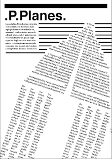
We were given a selection of posters in which we had to recreate some of them.With the Package having various similarities to Adobe Illustrator meant I didn't feel too lost in re-creating a poster, therefore , I decided to go home and re-create my own using the information we were given this afternoon.

Below are examples of the posters we were given to re-create


First Poster 

When creating this first poster I only used the rectangular tool to create the layout. This poster is a combination of thick and thin rectangles with no other complications. quite simple really. I used sample text to add some literature to the page just to give it some sort of character. I chose a cool blue scheme as i felt it made the poster look more calm and welcoming. I also experimented by using the dodge effect on the squares to get the opaque overlay effect.

Second Poster

This was the second poster i created. I started out by experimenting with the text box tools and realise i could distort the shape of the box and the text would follow the shape. This got me thinking that instead of using a shape tool i could use the text to create the shed instead. I settled with the triangle shape as when i mirrored it it resembled similarities to a paper plane. Hence why i used the title P.Planes. I then themed my poster around the aviation , i added jet streams made out of words and an American flag to give the background some characteristics.

Although my skills are still very new within InDesign i feel that they are quickly progressing and with more tutorials InDesign will become a powerful tool within the course. 


Wednesday, 7 October 2015

Approaches to Research - 20 Questions

In this seminar we were asked to get into pairs and ask each other 20 questions about a specific object. This task was particularly entertaining and also acted as an ice breaker to the seminar as many of us hadn't developed specific friend groups and links with other students yet. For this task i chose to work with Jack Pomfret.

The aim of the task was to show us how to dig deeper for information about something and show how you would word your questions in order to do this. However unlike a typical 20 questions we had to write the questions before we had even thought of the object , this was to show us what our original ways of gaining research were like and how (after the task) they could be improved on to get the best result.

some of my questions included;

-"is it an object?"

-"Does it require a power source of some kind?"

-"is it currently present within this room?"

To my surprise the questions i had drafted before had actually worked , as i managed to guess my partners object. However the strange thing was that we both picked the same object - An Ethernet cable port , something of which i would have never thought someone else would have picked. 

Could this be that we have the same thought process when researching?

Or do great minds think alike?

ha ha 


Monday, 5 October 2015

How to have an idea

In this lecture we looked at How to have an idea and how an idea can be composed. This was done to help us start to produce Ideas for our 'Sense of Place' project.

 The aim of researching into various fields is to communicate ideas through images, words and layouts. We also talked about how through the next few weeks each week would have an aim and a topic to focus our work on so that we have a wide spread of research for our concertina book. These were not there to follow exactly but more so to trigger our mind into producing alternative ideas but still be there to help us if we were struggling. personally i would like to stay away from these guidelines as i feel they may limit my thought process if i play it safe. This will help me to gather multiple ideas and responses to each topic and begin to create our my idea for the sense of place project.

Once i did this my end goal is to produce a number of ideas for the brief I have been given. I discussed how doing this can be one of the hardest parts of a project as my mind needs to settle into thinking about the brief and how it can tackle it. I feel that the best way to start off my ideas is to indulge myself in various forms of research such as Books , Exhibitions and Social Media.

He then began to discuss what can happen when the ideas don't come to us also known as writers block or creative block. During this time we should come up with a set of approaches and techniques that are already in place so that when this happens we have some sort of solution.


Idea: "a thought or suggestion as to a possible course of action".


Finally we looked at how we can find ideas. He discussed questions and ideas on the topic such as:
- How will you create an entry point into your topic?

- Is there something that intrigues you that can start a direction or train of thought, a discussion, an argument, an investigation to propel the thought process? 

- Is there a problem or an issue that needs to be identified before thinking?

Then he discussed way we can do this and get ideas out in the open:
- Attribute lists 
- Mind maps
- Synetics
- Moodboards
- Brainstorming
- Brain-writing
- Brain-drawing
- Timelines
- Genealogy 
- Sketching
- Storyboards

Thursday, 1 October 2015

Drawing 1 - Location

In the first Process and production task we were set out to produce a series of location drawings around Huddersfield town centre. These drawings could be created using multiple tools that we were given to use such as: finalisers , pencils , Pro markers and charcoal. We were also given an A2 sized art board to carry with us , this art board provided a sturdy drawing surface for us to work effectively in all locations we were given. 

Locations we traveled to included;
- Market and Piazza

- Gothic Quarter

- New Street shopping area (Primark)

Subjects we were asked to draw included;

-Line drawing study, featuring perspective.

-People and places

-Type in context

-Skylines

-Reflections

-Architectural themes

I felt that i did struggle in some parts of this task as it is something i am quite inexperienced in , particularly the perspective drawing parts , however i hope these sessions will develop my skills allowing me to progress further when using these techniques.
Perspective Drawing
Above is my attempt at the perspective drawing , this image is specifically of the gothic quarter in Huddersfield town centre. I struggled with the perspective drawing as i could seem to get the right angle with the lines to allow the buildings to fade off into the horizon smoothly. Instead it felt as if my structures were starting to look ut of shape. I also tried to make my images as detailed as possible but realised about half way through that detail isn't key and rough sketches can also be just as effective. Therefore if i was to do this again i would pay too much attention to detail and focus on sketching the main parts before paying attention to the finer detail.
Movement Drawing

In this image i looked specifically at the Coffee cali shop front , i chose this area as it seemed like a good location to draw movement. I first sketched the shop front onto one side of tracing paper then waited half an hour before sketching it again. this shows the difference in movement among the sample space over half an hours time. As you can see on the image above people have moved and populated the other spaces around the shop front.
People Drawing

In this drawing i didn't specifically chose people to sketch but instead i chose a pigeon as they were a common subject around the town centre and all looked very similar. For this drawing i experimented by using charcoal for the first time. I felt that the material was fairly easy to use and worked effectively when mapping shadows and areas that required mass shading. I would like to work in charcoal more often as i feel that it is one of the instruments that gets left out.