For our final After effects project was a collaborative piece between all the students in the group. We wanted to create something similar to the video Lantern Fish by Adam Gault. The lanternfish video is a video that displayed illustrations of different deep sea lantern fish , each one with different actions, each one of these actions leads into each other . for example one of the lantern fish would be killed by another and from the fishes remains another fish would appear leading onto the next transition with flow.
For our own videos we had to create a 10 second animation of a fish that just swam across the screen. For my animation i created a pack of Mantarays. I had one Mantaray that was my centre of attention , this is the vector which i added all the key animations to. Although simplistic i felt that adding a pack of Mantarays added to the detail. I added motion paths that made the fish look as if they're swimming.
Once the main path was created i added a sinking boat to the background , this was to add further detail to the animation and make it more identifiable as my own. I created the simplistic boat vector in illustrator so i could easily animate it. In my own animation i had to leave the background blank as it had to be exported to the public drive to be added to the main animation.
One thing about this animation was that i didn't particularly learn any new skills , the animation was fairly simple and didn't require any new skills to create the piece , i would have enjoyed it if i could have learnt a new skill to push my animation further.
The finale for the after effects sessions included all of our 10 second pieces stitched together. This created a piece similar to the lantern fish video. The background retained a constant colour while all the students fishes swam across the screen. I feel that the piece showed how far peoples after effects and illustrator skills had developed massively over the year.
Thursday, 21 April 2016
Drawing 6 - Final alphabet
In this session we had to finalise one of our typefaces. i chose my 'Muddy' styled typefaces to be finalised , this involved drawing it up on a bigger scale , making sure all the letters were the same dimensions to retain the style. i felt that this font was detailed enough to take forward as my final design as there was a lot of potential for the font to be adapted. My past designs all inspired this typeface , using a variation of sketches allowed me to have a large amount of choice when picking a final idea.


Once i had finalised my design i proceeded to adapt it to a phrase. this proved to be more difficult as i had to recreate the typeface with no guidance. However overall i feel that each letter worked well together and provided flow through the words. non of the letters looked wrong and out of place therefore creating a successful type style.

The typography workshops have helped me massively and allowed me to start looking into designing my own type , although early stages of this skill i feel that there is lots of potential , and eventually , with time i will be able to create my own typefaces for future projects.

Thursday, 14 April 2016
Cinema 4D 1 - Basics
Cinema 4D is one of the more Untouched softwares , purely because nobody has a clue how to use it and its insanely complicated without tutoring. I myself had looked into cinema 4D for my project 'visualising Sound' therefore had some basic idea as of what was happening on screen and what certain tools did what.
This tutorial was mainly about listening insanely carefully as there were that many items to edit one step wrong and everything fell apart. Our task was Generate a 3D Logo or name in Cinema4D, by extruding a vector created and imported from Adobe Illustrator. I began by typing my name in a font. Once the typeface was selected you could edit the thickness and spacing of the text to get a 3D effect. I played around in the settings for a while before setting on the right size for my task. I wanted to keep it simple so i only used the word Ben. i then added a ground to the text and edited the text settings so there was gravity on the individual letters making them sit heavily on the ground. After establishing some sturdy text i added texture to the ground (matte metallic) and a purple colour to the text. Originally this looked rather dull so i took it bit further and added light. I experimented with different styles of lighting but eventually settled for a spotlight as it provided the best effect on the textures. I found the realtime light interesting though as it acted like the sun and would position itself with whatever time it was on the clock , for example 12:00Pm and the light would be above the subject.
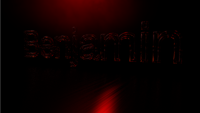
I repeated these steps for another step of text , this time using a stroke instead of block colour making the text hollow. The texture i used was like glass allowing the red light to be absorbed by and emitted by the glass lettering. Examples are shown below.

Overall i feel that Cinema 4D is a difficult piece of software to use and will definitely need some practise if i am to use it any further. One thing i would like to explore with it is product design and how you can make mock products such as bottles in the software. This is something i hope to explore in second year.
This tutorial was mainly about listening insanely carefully as there were that many items to edit one step wrong and everything fell apart. Our task was Generate a 3D Logo or name in Cinema4D, by extruding a vector created and imported from Adobe Illustrator. I began by typing my name in a font. Once the typeface was selected you could edit the thickness and spacing of the text to get a 3D effect. I played around in the settings for a while before setting on the right size for my task. I wanted to keep it simple so i only used the word Ben. i then added a ground to the text and edited the text settings so there was gravity on the individual letters making them sit heavily on the ground. After establishing some sturdy text i added texture to the ground (matte metallic) and a purple colour to the text. Originally this looked rather dull so i took it bit further and added light. I experimented with different styles of lighting but eventually settled for a spotlight as it provided the best effect on the textures. I found the realtime light interesting though as it acted like the sun and would position itself with whatever time it was on the clock , for example 12:00Pm and the light would be above the subject.
I repeated these steps for another step of text , this time using a stroke instead of block colour making the text hollow. The texture i used was like glass allowing the red light to be absorbed by and emitted by the glass lettering. Examples are shown below.


Overall i feel that Cinema 4D is a difficult piece of software to use and will definitely need some practise if i am to use it any further. One thing i would like to explore with it is product design and how you can make mock products such as bottles in the software. This is something i hope to explore in second year.
Thursday, 24 March 2016
Drawing 5 - Constructing Alphabets
This session involved looking further into typography by producing three different rough sketches of typefaces. we would then choose to finalise one of these ideas and produced a refined version of the typography for our final typography session. i enjoyed this task as it allowed me to produce some quick fire typography ideas. this session allowed my mind to work fast and draw freely as the sketches only had to be rough. I made sure the designs i produced were very different styles so i had lots of variation to work with.
 My first rough typeface was very circular based. i wanted to keep all lettering within a 3x3 gridded circle to retain the style. I enjoyed creating this font as it was very different to conventional typefaces. one thing that i struggled with was creating this type quickly producing each letter , this proved to be fairly difficult and took quite long to create. i particularly struggled with getting each part of the circle equally spaced to retain the shapes consistency therefore i will most likely not be continuing with this font style.

This typeface is a more simplistic Sans serif style , my aim was to not connect any of the parts of the type and use only straight lines and curves to create a sleek looking layout. This type reminds me of something that is stencil based and could be spray painted onto a wall. this font was a lot easier to produce than previous typefaces and i feel that it could be adapted into becoming quite a consistent lettering style.

This is my final typeface that i produced for the quick sketches , i wanted to try a more cartoon style typeface. this font gives off a muddy/slime feel to it , i added lines that made the text look as if it was melting in places. i feel like i will take this font into the final stages as i get the feeling that it could be adapted to different pieces and made into a more refined typeface. when creating it in final form i do need to retain letter sizing and a more consistent build in order to give it its best effect.
this task allowed me to work freely , under no pressure and really get a feel for type design. this was key as been new to type i needed time to get inspiration and explore possibilities. one thing i would like to do is take my type digital and start to play around with it as a vector image.


This is my final typeface that i produced for the quick sketches , i wanted to try a more cartoon style typeface. this font gives off a muddy/slime feel to it , i added lines that made the text look as if it was melting in places. i feel like i will take this font into the final stages as i get the feeling that it could be adapted to different pieces and made into a more refined typeface. when creating it in final form i do need to retain letter sizing and a more consistent build in order to give it its best effect.
this task allowed me to work freely , under no pressure and really get a feel for type design. this was key as been new to type i needed time to get inspiration and explore possibilities. one thing i would like to do is take my type digital and start to play around with it as a vector image.
Friday, 11 March 2016
After Effects 5 - 3D Type
This session was a further development from the last session that looked at a specific typeface. The session began with a video to give us inspiration for our pieces that we were to create. The video 'BBC Today - Stephen Hawing' shows how the camera can be used in after effects to give a sense of motion and atmosphere to the animation. In the Stephen Hawking sequence the camera travels through different words and phrases while also taking us on a journey through , what it looks like , a blackboard full of work.
For my own piece i decided to use lyrics from The Smiths song : Still Ill. I didn't try create a specific atmosphere for my own piece as i wanted to focus my attention on learning the new skills with the 3D camera. Before finalising my design it had a very messy feel , i couldn't get my text to align in the final frame due to the camera pacing through the text too quickly. I solved this problem by working backwards and arranging the text before adding the 3D effect.
I felt that the alternative above view came in very handy when creating the animation as you could see the exact motion path of the text as it moved throughout the text. The camera tool came with a series of transformations just like shapes and vectors do. These included options such as Depth of Field , Positioning and zoom.
My own animation consists of the camera moving backwards through the text , i used a depth of field to create an atmosphere when the text passed close over the camera. I used different weights of text to draw attention to specific words. I added the flip transformation to the word 'Mine' to draw attention to it. My favourite part about the animation is how it all sets in to one neatly arranged grid.
If i was to improve this animation i would add a background with a texture as it would add add more of a feel to the animation due to it been basic colours such as black and white. I feel that a photographic or textured background would work effectively , preferably one that would relate to the song.
For my own piece i decided to use lyrics from The Smiths song : Still Ill. I didn't try create a specific atmosphere for my own piece as i wanted to focus my attention on learning the new skills with the 3D camera. Before finalising my design it had a very messy feel , i couldn't get my text to align in the final frame due to the camera pacing through the text too quickly. I solved this problem by working backwards and arranging the text before adding the 3D effect.
I felt that the alternative above view came in very handy when creating the animation as you could see the exact motion path of the text as it moved throughout the text. The camera tool came with a series of transformations just like shapes and vectors do. These included options such as Depth of Field , Positioning and zoom.
My own animation consists of the camera moving backwards through the text , i used a depth of field to create an atmosphere when the text passed close over the camera. I used different weights of text to draw attention to specific words. I added the flip transformation to the word 'Mine' to draw attention to it. My favourite part about the animation is how it all sets in to one neatly arranged grid.
If i was to improve this animation i would add a background with a texture as it would add add more of a feel to the animation due to it been basic colours such as black and white. I feel that a photographic or textured background would work effectively , preferably one that would relate to the song.
Thursday, 18 February 2016
Drawing 4 - Inspiring type
Moving on from the object drawing we now started to look into typography workshops. This session involved inspiring ourselves to create different styles of type , eventually leading into creating our own alphabet. The session began by picking different illustrations and photographs to base our type on. The image i picked was an illustration of a man with psychedelic hair. I chose this as i felt there was a lot of potential for development , the hair provided flow and could be morphed into various shapes and forms.
We were given the letters ANESG to work with as they provided variation. i used the strands of hair to build up each letter , i made sure they flowed well and retained the style of the original illustration. I then began to adapt the hair to the illustration and started to use typography as the hair of the figure. I feel that one thing i would improve with this piece is colour , the colour adds to the psychedelic feel of the illustration , providing the vibrant characteristics. My type lacks this but could be easily adjusted. My type feels relatively messy in these stages as typography is a new thing that i have done before and never gone into it with this much detail.
In this stage my typography was only an experiment , i favour sans serif fonts as i feel they look cleaner however in later stages one of the things i hope to explore is serif fonts , mainly because i think they are more skilful to produce.

We were given the letters ANESG to work with as they provided variation. i used the strands of hair to build up each letter , i made sure they flowed well and retained the style of the original illustration. I then began to adapt the hair to the illustration and started to use typography as the hair of the figure. I feel that one thing i would improve with this piece is colour , the colour adds to the psychedelic feel of the illustration , providing the vibrant characteristics. My type lacks this but could be easily adjusted. My type feels relatively messy in these stages as typography is a new thing that i have done before and never gone into it with this much detail.
In this stage my typography was only an experiment , i favour sans serif fonts as i feel they look cleaner however in later stages one of the things i hope to explore is serif fonts , mainly because i think they are more skilful to produce.

Thursday, 11 February 2016
Photoshop 1 - Basics
Photoshop is one of my strong points within graphic design as i have self taught myself and been using the software since high school. Unfortunately on the day this session was held i was ill therefore i have had to catch up and produce the work in my own time. Photoshop is the software used mainly for working with high resolution images. Unlike Illustrator , photoshop works in Bitmap therefore scaling an image will result in lower quality resolution. I feel that photoshop tools are easier to locate and get the hang of , although most of these tools are present in illustrator they work slightly differently or are hidden in many of drop down menus.
Our first task was exploring the different colour modes of pictures. This was done through the Image > Mode > Adjustments then selecting an option. We first changed an image of our choice to greyscale.


Our first task was exploring the different colour modes of pictures. This was done through the Image > Mode > Adjustments then selecting an option. We first changed an image of our choice to greyscale.

After changing the colour to grayscale the menu opened up the duotone option. This setting allowed two-four colours to pass through the image , acting like a filter. This would add a slight tint to the image making it more interesting than just black and white. Other effects we looked at was Hue and saturation which would change the colours of a whole picture , for example you could make a lemon turn purple without ruining the image. Levels and curves also came in useful for editing photographs as you can alter how intense certain colours were in the image.

Our next task was to create a non destructive self portrait. We achieved this by using different layers to merge a picture of ourselves with objects or landscapes. I started out by picking a suitable image of myself to merge with another image. I then duplicated the image and placed a forrest scene picture between the two pictures , this was the image i was going to blend with my self portrait. To blend the image i used a rubber with 0% hardness so i could feature away at my portrait that would slowly expose the trees into my face.

Finished Piece
Subscribe to:
Posts (Atom)