For our final After effects project was a collaborative piece between all the students in the group. We wanted to create something similar to the video Lantern Fish by Adam Gault. The lanternfish video is a video that displayed illustrations of different deep sea lantern fish , each one with different actions, each one of these actions leads into each other . for example one of the lantern fish would be killed by another and from the fishes remains another fish would appear leading onto the next transition with flow.
For our own videos we had to create a 10 second animation of a fish that just swam across the screen. For my animation i created a pack of Mantarays. I had one Mantaray that was my centre of attention , this is the vector which i added all the key animations to. Although simplistic i felt that adding a pack of Mantarays added to the detail. I added motion paths that made the fish look as if they're swimming.
Once the main path was created i added a sinking boat to the background , this was to add further detail to the animation and make it more identifiable as my own. I created the simplistic boat vector in illustrator so i could easily animate it. In my own animation i had to leave the background blank as it had to be exported to the public drive to be added to the main animation.
One thing about this animation was that i didn't particularly learn any new skills , the animation was fairly simple and didn't require any new skills to create the piece , i would have enjoyed it if i could have learnt a new skill to push my animation further.
The finale for the after effects sessions included all of our 10 second pieces stitched together. This created a piece similar to the lantern fish video. The background retained a constant colour while all the students fishes swam across the screen. I feel that the piece showed how far peoples after effects and illustrator skills had developed massively over the year.
Thursday, 21 April 2016
Drawing 6 - Final alphabet
In this session we had to finalise one of our typefaces. i chose my 'Muddy' styled typefaces to be finalised , this involved drawing it up on a bigger scale , making sure all the letters were the same dimensions to retain the style. i felt that this font was detailed enough to take forward as my final design as there was a lot of potential for the font to be adapted. My past designs all inspired this typeface , using a variation of sketches allowed me to have a large amount of choice when picking a final idea.


Once i had finalised my design i proceeded to adapt it to a phrase. this proved to be more difficult as i had to recreate the typeface with no guidance. However overall i feel that each letter worked well together and provided flow through the words. non of the letters looked wrong and out of place therefore creating a successful type style.

The typography workshops have helped me massively and allowed me to start looking into designing my own type , although early stages of this skill i feel that there is lots of potential , and eventually , with time i will be able to create my own typefaces for future projects.
Thursday, 14 April 2016
Cinema 4D 1 - Basics
Cinema 4D is one of the more Untouched softwares , purely because nobody has a clue how to use it and its insanely complicated without tutoring. I myself had looked into cinema 4D for my project 'visualising Sound' therefore had some basic idea as of what was happening on screen and what certain tools did what.
This tutorial was mainly about listening insanely carefully as there were that many items to edit one step wrong and everything fell apart. Our task was Generate a 3D Logo or name in Cinema4D, by extruding a vector created and imported from Adobe Illustrator. I began by typing my name in a font. Once the typeface was selected you could edit the thickness and spacing of the text to get a 3D effect. I played around in the settings for a while before setting on the right size for my task. I wanted to keep it simple so i only used the word Ben. i then added a ground to the text and edited the text settings so there was gravity on the individual letters making them sit heavily on the ground. After establishing some sturdy text i added texture to the ground (matte metallic) and a purple colour to the text. Originally this looked rather dull so i took it bit further and added light. I experimented with different styles of lighting but eventually settled for a spotlight as it provided the best effect on the textures. I found the realtime light interesting though as it acted like the sun and would position itself with whatever time it was on the clock , for example 12:00Pm and the light would be above the subject.
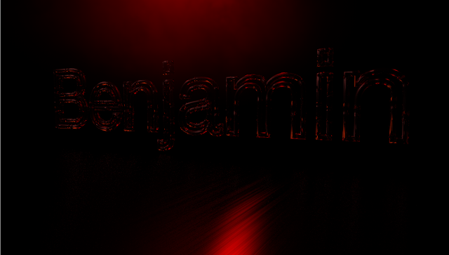
I repeated these steps for another step of text , this time using a stroke instead of block colour making the text hollow. The texture i used was like glass allowing the red light to be absorbed by and emitted by the glass lettering. Examples are shown below.

Overall i feel that Cinema 4D is a difficult piece of software to use and will definitely need some practise if i am to use it any further. One thing i would like to explore with it is product design and how you can make mock products such as bottles in the software. This is something i hope to explore in second year.
This tutorial was mainly about listening insanely carefully as there were that many items to edit one step wrong and everything fell apart. Our task was Generate a 3D Logo or name in Cinema4D, by extruding a vector created and imported from Adobe Illustrator. I began by typing my name in a font. Once the typeface was selected you could edit the thickness and spacing of the text to get a 3D effect. I played around in the settings for a while before setting on the right size for my task. I wanted to keep it simple so i only used the word Ben. i then added a ground to the text and edited the text settings so there was gravity on the individual letters making them sit heavily on the ground. After establishing some sturdy text i added texture to the ground (matte metallic) and a purple colour to the text. Originally this looked rather dull so i took it bit further and added light. I experimented with different styles of lighting but eventually settled for a spotlight as it provided the best effect on the textures. I found the realtime light interesting though as it acted like the sun and would position itself with whatever time it was on the clock , for example 12:00Pm and the light would be above the subject.
I repeated these steps for another step of text , this time using a stroke instead of block colour making the text hollow. The texture i used was like glass allowing the red light to be absorbed by and emitted by the glass lettering. Examples are shown below.


Overall i feel that Cinema 4D is a difficult piece of software to use and will definitely need some practise if i am to use it any further. One thing i would like to explore with it is product design and how you can make mock products such as bottles in the software. This is something i hope to explore in second year.
Subscribe to:
Comments (Atom)